We announced the new #AsiaBerlin logo and color scheme in June 2020. The new logo was a further step to consolidate all Asia-related startup initiatives by the Berlin Senate into a collective platform – AsiaBerlin – Connecting Startup Ecosystems with an umbrella brand. More details on restructuring can be found here. Here is a look at the rationale behind the new logo and the meticulous design thinking approach used.

“Our mission is to bring together the startup ecosystems in Berlin and Asia and strengthen the bonds within our growing AsiaBerlin community. Our values, vision, and mission are taken into consideration while forming the new logo and design. We are happy that the logo was designed and conceptualized by Ideactio, a strategic design consultancy based in Singapore and Berlin led by AsiaBerlin Ambassador Nav Qirti,”
says Rainer Seider, Head of Unit, International Cooperation, Berlin Senate, and Initiator of AsiaBerlin.
The new logo is composed of three basic elements: a logomark, the name of the umbrella brand (AsiaBerlin) or the summit (AsiaBerlin Summit) as a wordmark, and a tagline that explains the core message of the initiative: Connecting Startup Ecosystems.
The concept
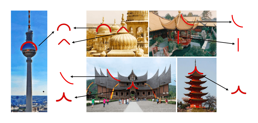
The logomark forms an abstract ‘AB’ for AsiaBerlin and the overlapping ‘A’ and ‘B’ represents the coming together of Asia and Berlin. The A as an inverted ‘V’ is inspired by the roof architecture commonly found in Asia that signifies growth. The font family selected for the AsiaBerlin brand is Futura PT, a geometric sans serif typeface that complements the brand logo and identity. It is neutral yet versatile and works well in both print and digital text.
The Colors: Blue and Red
There will be two main colors for the AsiaBerlin brand to represent the coming together of Asia and Berlin. Red is a common color amongst the country flags and is a color commonly associated with Asia. It represents boldness and energy, which are valuable traits for startup companies. Blue represents dependability and trustworthiness and serves as a complement to the boldness of the red color. The bold duo color palette has been chosen to enhance the identity and ensure strong visibility and contrast.
The Process
Inspired by the design thinking process, after ideation of 9 different logos — the Ideacto team collected feedback from members of the AsiaBerlin team in the Senate, the Board of APFB, and the AsiaBerlin Ambassadors through four iteration rounds. The inputs were blended into the final logo design which defines the goals and core values of the AsiaBerlin Initiative. Finally, visual identity and guidelines were finalized.
Want to be updated on all the fun we are having at AsiaBerlin? Follow us on Linkedin , Instagram and Twitter for regular updates on all AsiaBerlin activities.


